Samaritan House is operated by The Salvation Army’s Crisis Accommodation service. The Salvation Army has fundraised to redevelop this facility, so the design must be financially conscious, ensuring resources are allocated efficiently to deliver the greatest value for the project. The Salvation Army’s expectation is that the artwork provides joy, courage and hope to those who experiencing extreme uncertainty in their lives. It is envisioned the artwork capture these values while considered the diverse ethnicity and ages within the House.
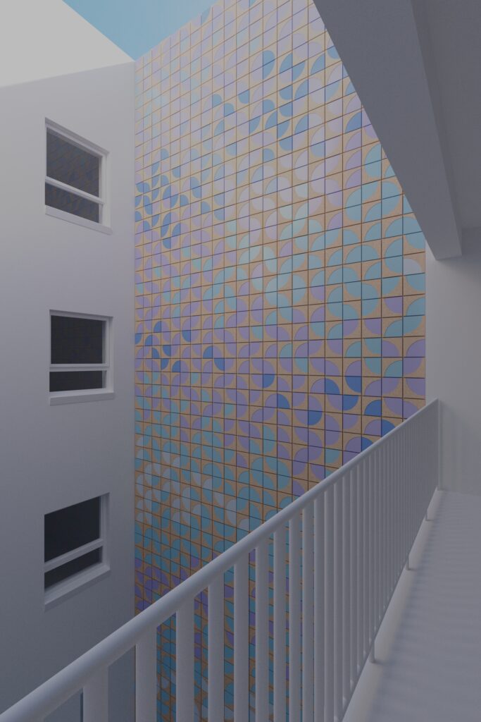
The proposal positions the artwork on the north-facing wall of the buildings’ southern light court, which is at the heart of the site. The light court is the most visible space in the interior of the building. It is visible from the main ground floor circulation that most of the staff use everyday, and the staff room and the main staff meeting room frame either side of it. Glazed tiles were seen as an optimal medium for their robust finish and their qualities of reflection, to aid the reflection of light down the depth of the light court.
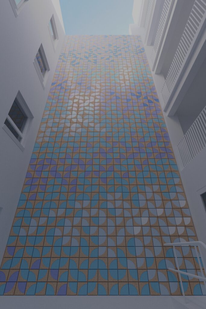
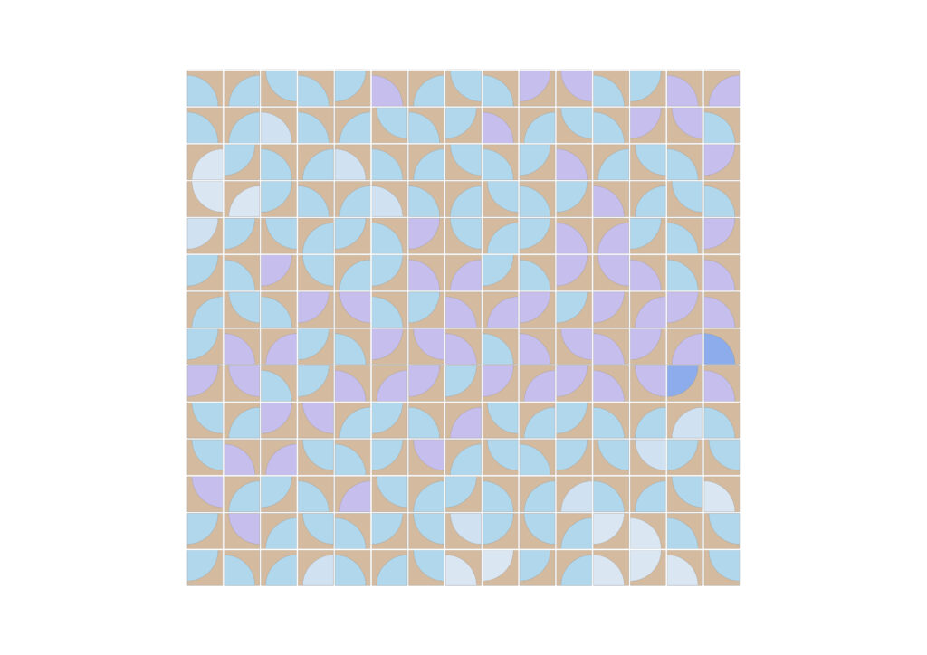
The quarter circle as a pure abstraction is also evocative of figurative elements such leaves, wings or feathers – it evokes a sense of light and movement.
Colours are carefully chosen from a palette of psychologically calming colours, designed to reduce stress and promote relaxation. These are dominated by cool tones and muted, nature-inspired shades. Blue is considered the most calming colour, often lowering heart rates, followed by soft greens, muted lavender, and neutral tones like grey, beige, or taupe, which create a serene, harmonious environment.
The southern wall of the light court is unencumbered by windows and can function as a unifying vertical canvas across the five levels of the building. The light court is also important for bringing light and air into the main body of the building and so is central to the building’s everyday inner life.